.jpg?width=1280&height=720&name=rsz_adobestock_219643762-min%20(1).jpg)
“I like the look of that sound,” said the audio engineer after eyeing the speaker’s frequency response graph.
Is it that simple? Can your eyes hear a frequency response graph, this curvy collection of plotted data points?
A frequency response graph depicts a loudspeaker’s ability to produce sound across a range of frequencies delivered to it. It shows your eyes how your ears might receive a speaker’s bass, midrange, and treble sound production. The X axis of such a graph plots frequency, usually from 20 to 20kHz, and the Y axis shows amplitude measured in dB SPL. It’s common for the Y axis to span 50 or 60 dB.
A perfect full-range speaker would create a flat-line frequency response graph, meaning the speaker’s frequency output will produce sound at the same dB level across every audible frequency. The perfect speaker, of course, has not (yet) been manufactured. In the real world, we see frequency response graphs with rises and dips that indicate how a speaker accentuates or attenuates sound at certain frequencies. These sound fluctuations make frequency response reporting important to any engineer shopping for speakers or designing an audio system.
These charts (and your eyes), however, can mislead you. Accurate measurement of a speaker’s output depends on a few factors, including the testing equipment, software employed, room setup, and the technician’s knowledge. Plus, the data must be presented objectively. Here’s what to look for (or look out for) when eyeing a frequency response graph.
On-Axis and Off-Axis Reporting
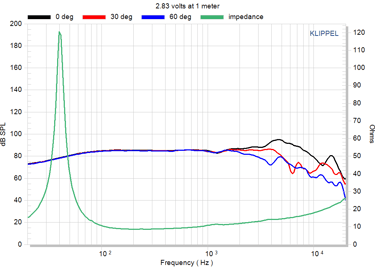
Many speaker manufacturers test speakers on-axis only, that’s with a microphone at one point directly in front of and near the speaker. While that is a good place to begin testing, on-axis reporting tells your eyes and ears just a small part of a speaker’s sound story. Off-axis measurements—those made from 30-degree or 60-degree angles (or others) to the right or left of the speaker—represent realistic positions for any listener. Frequency response measurements that include on- and off-axis are best.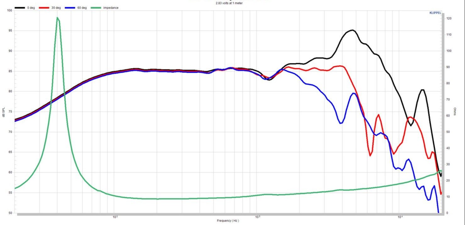
Graphical Presentation
You might call it the Photoshop of frequency response, but most speaker manufacturers smooth their graphs before publishing. MISCO does too, and it’s important to know the extent of the smoothing that’s presented. When a frequency response graph is smoothed, its most extreme peaks and valleys are diminished. Like with Photoshop, smoothing can be used to clarify or to deceive. Audio scientists agree that your ears smooth sound waves naturally, to different amounts at different frequencies. Smoothing a frequency graph to certain degrees (measured in fractions of an octave) represents that inherent trait and makes the graphs easier to read.
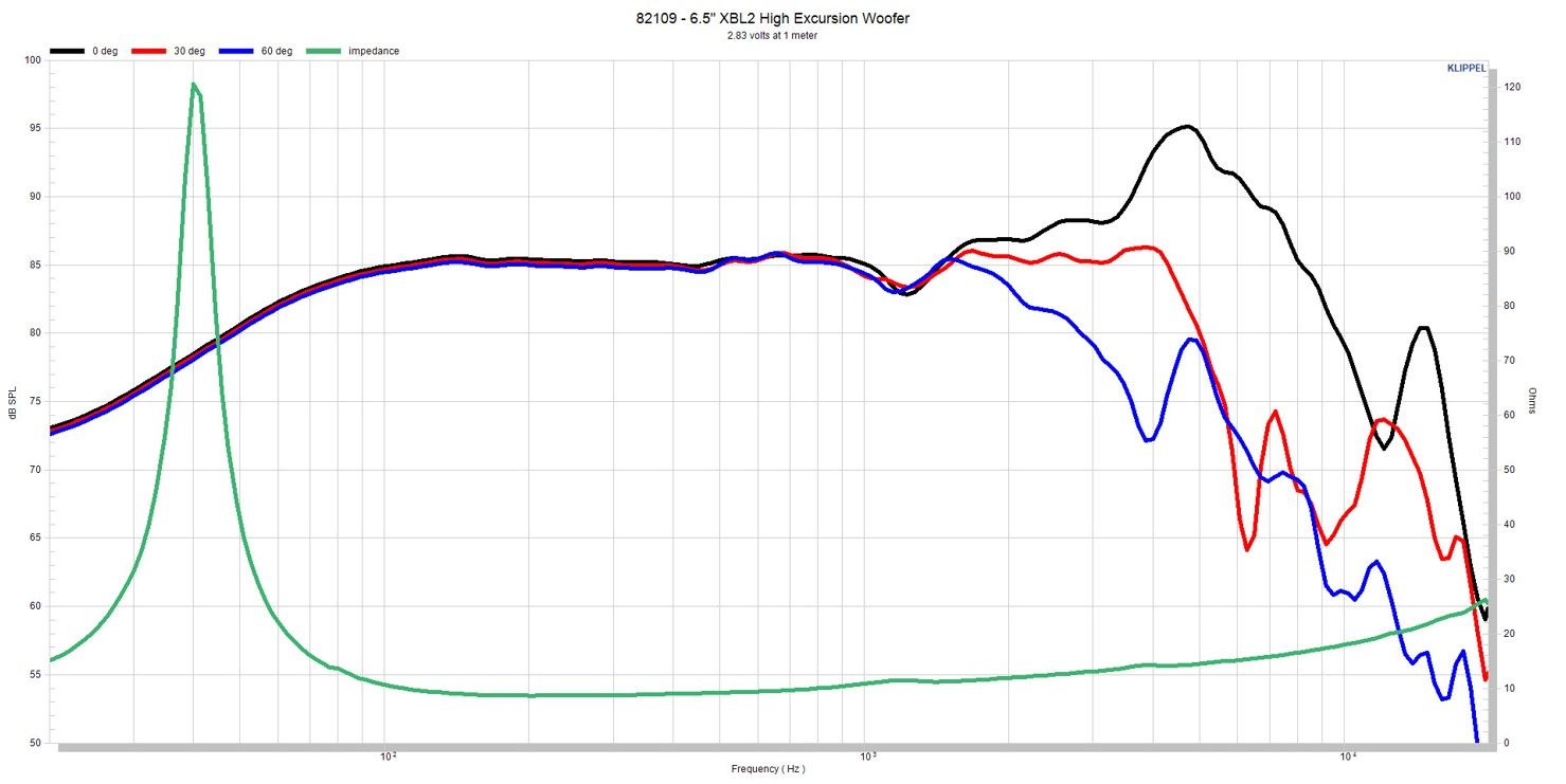
At MISCO, we apply smoothing in 1/24th octave measurements. Some manufacturers smooth graphs up to 1/6th octave, and that can create a picture that is prettier than it actually sounds. Take the below graphics for example, on the left, you’ll see a stretched version of the original frequency response graph and on the right, an over extremely stretched version.
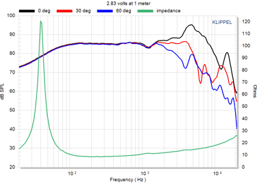
Stretched Over Extremely Stretched
You also need to look closely at both the X and Y axes of a frequency response graph. By compressing the dB level on the Y axis, for example, a speaker manufacturer can minimize peaks and valleys that show a component’s real performance. As previously noted, this is why it’s important to examine the frequency range presented.
Test Location
Anechoic chambers are specially constructed rooms that eliminate reflected sound signals. When tested in a room free from echo and reverberation, a speaker will produce a frequency response graph depicting only the sound produced by the speaker, not the sound that reflects off the wall, ceiling, or floor. Some manufacturers resort to software-enhanced methods to splice together measurements made in test locations with reflected sound. Others test speakers outdoors, which can add infinite audio sources (even a train a mile away) that can make their way into the measurement.
At MISCO, we incorporate Near Field Scanner (NFS) technology developed by German audio testing company Klippel. With NFS, we can test components in a normal listening space, outside of an anechoic chamber, with repeatable results anywhere an NFS is deployed. Since the measurement software “knows” the room, it is taken out of the measurement. The technology combines robotics and powerful software, using a microphone that rotates around a speaker to gather thousands of measurements in a spherical pattern.
This “radiation” frequency response plot shows in detail the complete picture of a speaker’s performance. And while the equipment and software are costly, NFS testing allows greater detail and increased flexibility over anechoic chambers. Both test methods are important as we continue to develop new products.
As you shop for speakers with your eyes, pay close attention to the information presented by a component manufacturer. Read and compare frequency response graphs carefully and check the manufacturer’s technical notes and testing methods. Don’t let your eyes deceive your ears.